From Handbill to Digital Listing: What Changed in Show Information
From handbill to digital listing, see how performance details can move from a compact invitation to useful, updateable audience information.
The common mistake with show information is to treat a digital listing as a handbill pasted onto a screen. That leaves audiences with a neat block of copy that answers the old questions but not the new ones: where to tap, what may change, and what they need to know before setting out. From handbill to digital listing, the format has changed the job as much as the appearance.
Imagine a small theatre presenting an invented evening of short performances called Rooms for Listening. Its first notice is a printed handbill for cafés and libraries; the same event later appears on the theatre’s website, a ticketing page and a social post. The show remains the same. What changes is the distance between the information and the decision to attend.
What did a handbill ask an audience to do?
The handbill is a compact object with a clear limit: someone must encounter it, read it, and retain enough detail to act. Its address, date, start time and title have to sit together, often beside a short description and a visual cue. A reader may take it home, pass it to a friend or leave it on a café table for the next person.
That physical journey gives the handbill a social role. It is not merely a miniature database; it can be noticed while someone waits for coffee, or offered directly by a performer after another event. Its design must work at a glance, because the reader may be standing, distracted or not yet committed to an evening out.
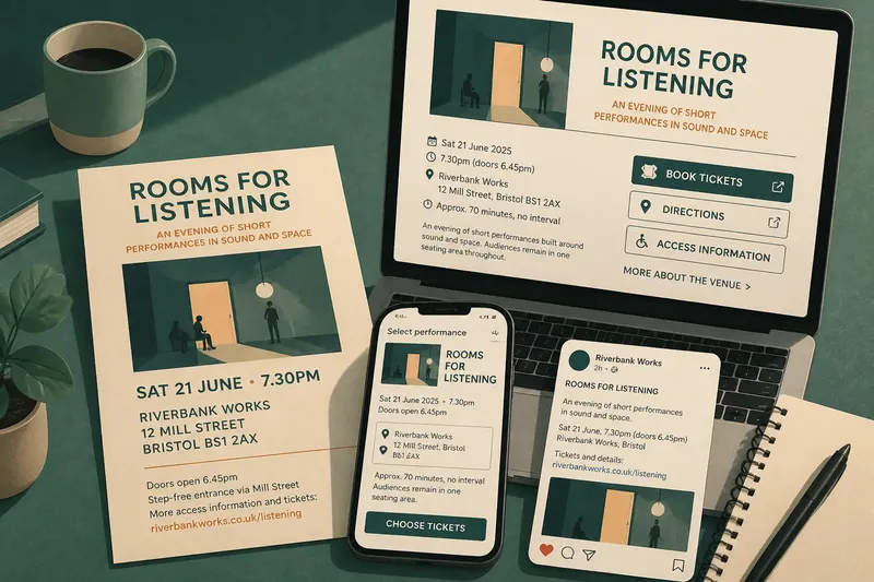
For Rooms for Listening, the theatre’s invented handbill uses a short title, a plain description of the performance, the venue’s full name and address, and a prominent date and start time. The back includes a brief access note and a way to find tickets. There is no room for a lengthy account of each piece, and that constraint makes the order of information visible.
Why does a digital listing behave differently?
A digital listing can be found without the reader already holding the object. Someone might arrive through a search result, a venue calendar, a ticketing platform, a link from a friend or a social post. The listing therefore needs to make sense on its own, without assuming that its reader has seen the poster or knows the company.
It can also connect information rather than merely print it. A date can lead to a booking page; an address can open a map; an access note can link to a fuller venue page. Those connections help only if the label is clear and the destination is current. A button marked “More” is a small exercise in optimism.
The digital version of the invented listing gives the essentials near the top: event name, venue, date, start time, duration if confirmed, and a concise description. It then provides separate links for booking, directions and access information. The structure lets a reader scan the essentials or continue into detail without forcing every visitor through the same paragraph.
How should the information change between formats?
Copying the handbill verbatim into every digital channel is tempting, especially when the wording has already been approved. But each format has a different reading situation. A handbill has limited space and may be shared physically; a website can carry detail and links; a social post often needs to make the event recognisable before the reader scrolls away.
That does not mean writing three unrelated descriptions. Keep the event’s central promise consistent, then adjust the amount and arrangement of detail. The title should not change from channel to channel, and the venue name should not alternate between a formal title and a nickname unless both are explained.
- Handbill: use a legible title, a short description, the essential visit details and a clear route to booking.
- Venue listing: state what the audience will encounter, then add practical details and links in labelled sections.
- Ticketing page: make the event identity and selected performance time unmistakable before the reader reaches payment.
- Social post: give enough context to identify the event and point to a fuller source, rather than squeezing every caveat into the caption.
For the invented show, the handbill’s description says that the evening brings together short performances built around sound and space. The website expands that line to explain the order of the event and whether the audience remains in one seating area. The social post uses the same central description, then links to the listing. No channel promises a different kind of evening.
What should a listing make easy to check?
Show information is useful when a reader can answer practical questions without decoding promotional language. “An intimate, immersive encounter” may set a mood, but it does not say whether the audience will sit, stand or move. If the format affects a visit, say so directly and place that detail where it can be found.
For Rooms for Listening, the theatre notices that its draft says “doors open before the performance” but does not say what that means for someone who arrives close to the start. The wording is revised to distinguish the listed start time from the time the room opens, and the ticket page repeats that distinction beside the chosen date. This is an invented editorial decision, not a report of a real production; the expected result is that the two times are easier to tell apart.
Useful details often include the venue entrance, seating or standing arrangements, access information, age guidance where relevant, and whether the event includes an interval. Not every show needs every detail. The useful test is whether leaving a fact out might lead an audience member to make a mistaken assumption about attending.
Which details deserve a fuller answer?
Where should access information appear?
Put a concise, specific access note on the main listing, with a clearly labelled link to fuller venue information where needed. Requiring a reader to hunt through a general venue page before learning whether the performance space is step-free adds effort at the point when they are deciding whether to book.
Should the listing include a long description?
Include enough description to distinguish the event from a generic night out, then provide further context if it helps someone decide. A long account of the creative process may belong on a separate page; the first screen should still tell a reader what the performance is and where it happens.
What if a performance detail changes?
Update the source listing and any channel that carries the changed detail, especially the ticketing page and the venue’s own event page. If a printed handbill cannot be changed, avoid adding claims to digital copy that make the two versions appear to describe different events; communicate the current practical information directly through channels the audience can check.
How can a reader know which page to trust?
Make the venue’s event page the clearly identified source for current details, and link to it from posts or partner listings. Where another platform is used for booking, keep its event name, date and time aligned with that source so the audience is not asked to choose between competing versions.
What does the invented case reveal?
In the imagined Rooms for Listening campaign, the handbill succeeds as a compact invitation in places where the venue’s audience already gathers. The digital listing succeeds differently: it supports discovery, answers more practical questions and connects the event to booking and directions. Neither format replaces the other simply by existing.
The useful lesson is to treat each appearance as a distinct encounter with the same event. A printed notice should make the show memorable and its essentials readable. A digital listing should carry enough context to stand alone, make relevant details easy to locate and point towards the next useful action.
Before sending either version into circulation, read it as someone unfamiliar with the venue would: identify the event, find the date and place, understand what attending involves, and locate the next step. From handbill to digital listing, the better measure is not how much copy survives the transfer, but whether the audience can make a clear decision without asking the poster to explain itself.